Default & Enhanced Homepage
Enhanced Homepage: Index - Parameters
Parameters can be accessed once a file is checked out (lighbulb icon is illuminated) by clicking:
- "Properties", then "Parameters" on the left side navigation.
- "MultiEdit", then "Parameters" on the left side navigation.
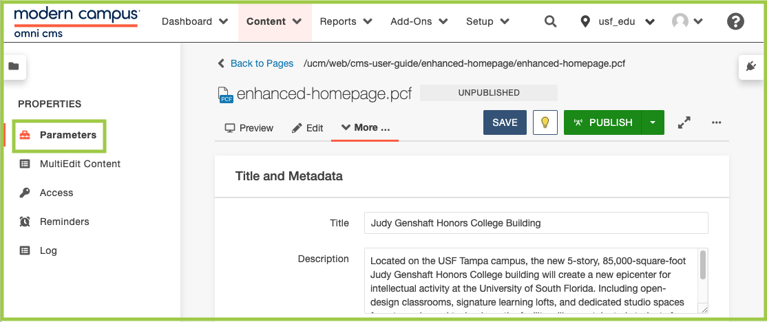
Tip: Think of Index - Parameters as a setup area for content features. Once you have your page looking the way you like it, you then edit the content displayed in those areas by navigating to the MultiEdit or editing the widget(s) you selected to be displayed.
Metadata and Title
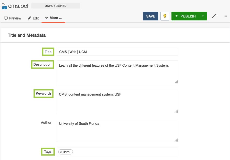
Metadata
For any page you create, you will need to update the Title and Description in the Properties section of each page.
Update Page Properties
- Check out the page you're working on by clicking the lightbulb icon.
- Click Properties.
- It will automatically take you to the Parameters tab.
- From there, update the Title based on the guidelines below.
- Update the Description by adding a short sentence about what the page is about.
- Include keywords and/or tags (if applicable).
- Click Save.
- Publish.
Learn more about creating great metadata.
Title
A page title, also known as a title tag, is the word or phrase that appears in the tab in an Internet browser, at the top of an Internet browser window, and on an Internet search result page. Creating the correct page title descriptions can help boost your site's web pages on Google's Search Engine Results Page (SERP) and make it easier for visitors to find your information. Learn more about creating great page titles.
Text Page Title Examples
- Content Title | Department/College Name
- Content Title | Section Title | Department/College Name
- Content Title | Department/College Name | USF/University of South Florida
- Do not have the same words or phrases appear multiple times.
- Example: College of Engineering | Engineering | Engineering
Custom Settings
Hero
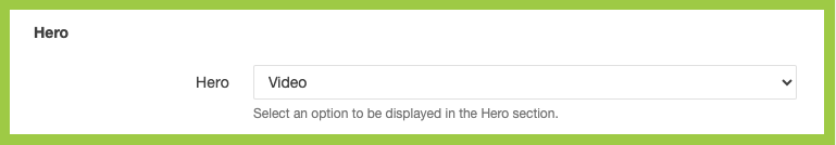
The Hero is a required element for Enhanced Homepages. It will display immediately below the header. This section selects the type of Hero that will display on the Enhanced Homepage.
The Hero can display:
- One Image
- Full-width
- One Video
- Full-width
- (Pause button added automatically for accessibility purposes.)
Select Hero Type (Image or Video)
- Scroll to Custom Settings.
- In the Hero section, select Hero type by using the drop-down menu.
Homepage Layout Order
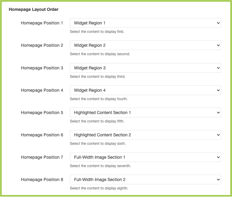
The Homepage Layout Order dictates the chronological order of Widget Region(s), Highlighted
Content Section(s), and/or Full-Width Image(s) as they will appear as users scroll
down the Enhanced Homepage.
Arrange Homepage Layout Order
- Under Hero, scroll to Homepage Layout Order.
- Using the Homepage Position drop-down menus, select the order of Widget Region(s),
Highlighted Content Section(s), and/or Full-Width Image(s) as they will appear as
users scroll down the Enhanced Homepage.
- Once you have chosen a section in a drop-down, do not choose that same section in
a different Homepage Position.
- If the same drop-down section is selected, the Homepage Position proceeding it will override the action.
- Once you have chosen a section in a drop-down, do not choose that same section in
a different Homepage Position.
- You can choose to "Show" or "Hide" all or some Widget Region(s), Highlighted Content Section(s), and/or Full-Width Image(s) sections.
Highlighted Content Section 1 and 2*
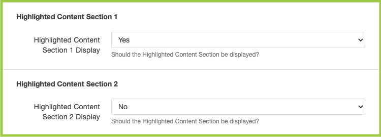
The Highlighted Content Section 1 and 2 dictates if the Highlighted Content Section 1 and/or 2 are shown or hidden from the Enhanced Homepage.
Show/Hide Highlighted Content Section 1
- Under Homepage Layout Order, scroll to Highlighted Content Section 1.
- Using the drop-down menu, select "Yes" or "No".
- Yes = shown on the Enhanced Homepage
- No = hidden from the Enhanced Homepage
Show/Hide Highlighted Content Section 2
- Using the drop-down menu, select "Yes" or "No".
- Yes = shown on the Enhanced Homepage
- No = hidden from the Enhanced Homepage
Note: To edit the content in a Highlighted Content Section, follow the instructions on Index - MultiEdit.
*You can choose to "Show" or "Hide" both or either of these sections.
Full-Width Image Section 1 and 2*
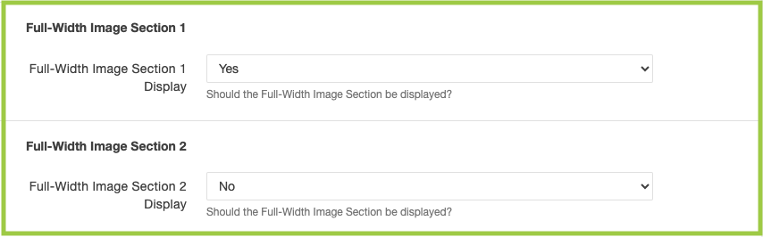
The Full-Width Image Section 1 and 2 dictates if the Full-Width Image Section 1 and/or 2 are shown or hidden from the Enhanced Homepage.
Show/Hide Full-Width Image Section 1
- Under Highlighted Content Section 2, scroll to Full-Width Image Section 1.
- Using the drop-down menu, select "Yes" or "No".
- Yes = shown on the Enhanced Homepage
- No = hidden from the Enhanced Homepage
Show/Hide Full-Width Image Section 2
- Using the drop-down menu, select "Yes" or "No".
- Yes = shown on the Enhanced Homepage
- No = hidden from the Enhanced Homepage
Note: To edit the content in a Highlighted Content Section, follow the instructions on Index - MultiEdit.
*You can choose to "Show" or "Hide" both or either of these sections.
Widget Region 1, 2, 3, and 4*
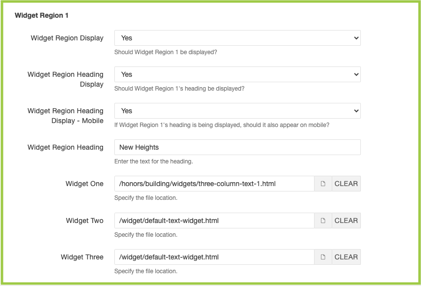
The Widget Region 1, 2, 3, and 4 dictates if the Widget Region 1, 2, 3, and/or 4 are shown or hidden from the Enhanced Homepage, if headings will be displayed, and/or which widgets will be used (linked).
Show/Hide Widget Region 1, 2, 3, and/or 4 + Heading
- Under Full-Width Image Section 1, scroll to Widget Region 1.
- Using the drop-down menu, select "Yes" or "No".
- Yes = shown on the Enhanced Homepage
- No = hidden from the Enhanced Homepage
- If "Yes" is selected above, use the Widget Region Heading Display drop-down menu and
select "Yes" or "No".
- Yes = heading is displayed above the Widget Region
- No = heading is hidden above the Widget Region
- Select "Yes" or "No" using the Widget Region Heading Display - Mobile drop-down menu.
- If "Yes" is selected for Widget Region Heading Display and/or Widget Region Heading Display - Mobile, enter the heading in the Widget Region Heading field.
- Repeat Steps 1-5 for Widget Region 2, 3, and/or 4 (if applicable).
Link Widgets in Widget Region 1, 2, 3, and/or 4
- In the Widget One field, click the document icon ("Choose File"). Using the Dependency Manager, navigate to the widget you want displayed in the Widget Region.
- Click the document icon, navigate to and click on the widget you want displayed.
- In the Widget One field, a one, two, or three-column widget can be selected.
- If a two-column widget is selected, it will override the content in the Widget Two field.
- If a three-column widget is selected, it will override the content in the Widget Two and Three fields.
- In the Widget Two field, a one or two-column widget can be selected.
- If a two-column widget is selected, it will override the content in the Widget Three field.
- In the Widget Three field, a one-column widget can be selected.
- Repeat Steps 1-3 for Widget Region 2, 3, and/or 4 (if applicable).
- In the Widget One field, a one, two, or three-column widget can be selected.
Note: Widgets need to be created and published prior-to. See how to edit and/or create widgets.
*You can choose to "Show" or "Hide" all or some of these sections.