Default & Enhanced Homepage
Widgets
Recorded Workshop
Overview
Custom widgets create additional functionalities on USF homepages. The widget section is a required element for all USF homepages. The section is highly customizable, with various layout options including: one three-column widget, one two-column widget and one one-column widget, or three one-column widgets. Examples include featured stories, news feeds, call-to-action items, and more. Learn how to edit widgets on your USF homepage.
When your website is created, the submitted wireframes allows you to choose the widgets that will be displayed on your homepage. Once your homepage is live, you can edit the existing widgets create new widgets.
- Create a New Widget
- Add a Widget to Your Homepage
- Edit an Existing Widget
- Most Commonly Used Widgets
- Full List of Widgets
create a new Widget
- From the Modern Campus CMS home screen, navigate to your site folder.
- Click on your unit's folder.
- Scroll to and click on the "widgets" folder.
- Click either "New" or the arrow icon.
- Clicking the arrow icon will provide a quick look at which widgets are available, while clicking "New" will provide a larger view.
- Select the type of widget you want to create.
- Complete all required information, following all instructions.
- Click "Create".
- Click "MultiEdit".
- Make all appropriate changes.
- Click "Save".
- From the Publish drop down menu, select which action is appropriate for your permission level/workflow (Publish, Schedule, Submit for Approval, etc.).
Note: If you are building a test site, publish the new widget to both Production and Test. Even though your website is not live yet, the new widget needs to be published to Production to operate correctly. All changes after initial creation can be published to just Test.
add a widget to your homepage
- Click the Properties button in the page options at the top of the homepage (index.pcf file).
- Click the document icon, navigate to and click on the widget you wish to use. You
may also enter in the path manually. Widgets need to be created and published prior
to selecting them here.
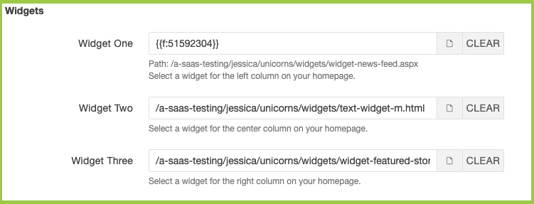
- Click Save.
- From the Publish drop down menu, select which action is appropriate for your permission level/workflow (Publish, Schedule, Submit for Approval, etc.).
edit AN EXISTING WIDGET
- Navigate to your unit's directory (website folder).
- Click on the "widgets" folder.
- Check out the widget that you want to edit by clicking the light bulb icon.
- (If applicable) Click the MultiEdit button.
- Make all appropriate changes via MultiEdit > Parameters, MultiEdit > MultiEdit Content, and/or Edit.
- Click Save.
- From the Publish drop down menu, select which action is appropriate for your permission level/workflow (Publish, Schedule, Submit for Approval, etc.).
commonly used widgets
Call to Action
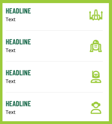
If you choose the Small Photo, Small Rotator, or Small Video option, you can opt to display four vertical call to action boxes to the right or left of the Hero section. If you choose the Large Photo or Large Rotator option, you can opt to display four horizonal call to action boxes underneath the Hero section.
The purpose of the Call to Action Widget is to drive traffic to specific functionality on your website. For example, at different points of the year, you may want to drive prospective students to apply, or donors to give, or community members to attend a campus event. In order to implement this option successfully, you need to identify your key audience(s), analyze their needs, and meet those needs by producing a Call to Action that allows them to complete a specific task that you know is important to them.
- Icon (3 or 4)
- Icons are located in /images/cta-icons.
- Headline (3 or 4)
- Each Headline must include one link.
- Headline has a character limit of 20.
- Summary (3 or 4)
- Summary has a character limit of 50.
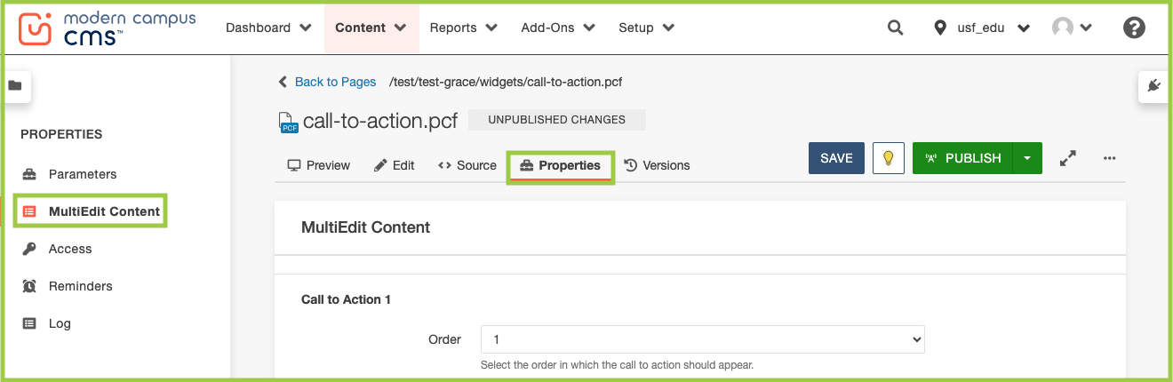
Edit Call to Action widget:
- Navigate to your unit's directory (website folder).
- Click on the "widgets" folder.
- Check out the Call to Action widget by clicking the light bulb icon.
- Click the MultiEdit button.
- The editing screen will appear as Properties > MultiEdit Content.
- The editing screen will appear as Properties > MultiEdit Content.
- Start with Call to Action 1:
- Use the Order dropdown menu to choose the Call to Action icon order (as they appear
down the page (vertically) or across the page (horizontally)).
- The Call to Action widget will appear vertically if it is chosen as the Feature Sidebar Widget in Index > Properties > Parameters.
- The Call to Action widget will appear horizontally if it is used in the dedicated
Horizontal Call to Action section in Index > Properties > Parameters.
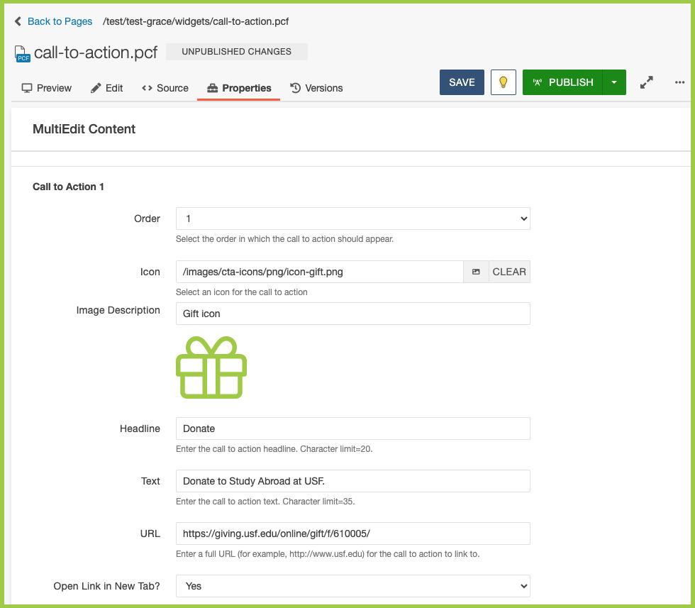
- Choose the Call to Action icon you would like to use via the Dependency Manager.
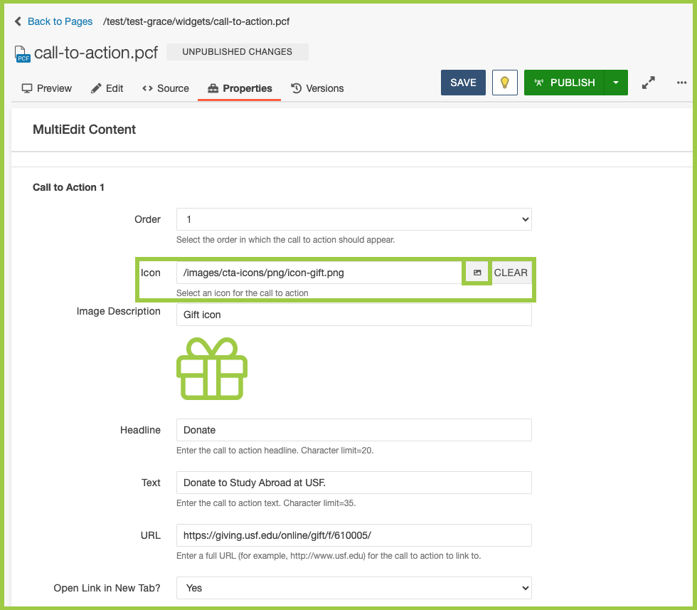
- Use the Filter field to search for the icon or scroll through the list.
- Click the icon you would like to use. Then click Insert.
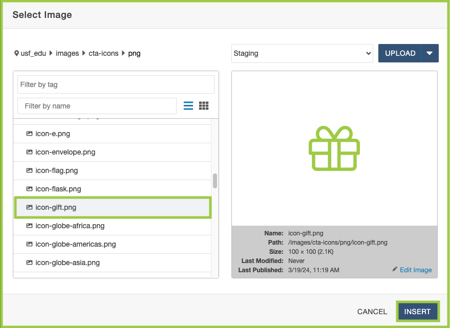
- Click the icon you would like to use. Then click Insert.
- In the Image Description field, add alt text for the icon.
- In the Headline field, add the headline.
- In the Text field, add the text that will appear underneath the headline.
- In the URL field, add a full URL that will be linked in the icon and headline.
- If the link lives outside the CMS, change the Open in New Tab? dropdown to "Yes".
- If the link lives inside the CMS, keep the Open in New Tab? dropdown as "No".
- Repeat Steps 1-7 for Call to Action 2-4.
- Click Save.
- From the Publish drop down menu, select which action is appropriate for your permission level/workflow (Publish, Schedule, Submit for Approval, etc.).
- Use the Order dropdown menu to choose the Call to Action icon order (as they appear
down the page (vertically) or across the page (horizontally)).
Featured Story
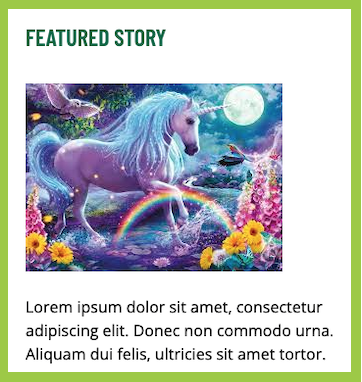
This option provides an opportunity to display a single featured story produced by your unit. The story could be about a faculty member, a student, an upcoming event, an initiative important to your unit’s leadership, etc. This option is not recommended for units that do not have a communication professional on staff.
-
Featured Story options include:
- Image
- Sized 320 px by 213 px.
- Headline
- Each Headline must include one link.
- Headline has a character limit of 20.
- Story Text
- Story Text has a character limit of 150.
- Image
Please note: If using the Featured Story – Three-Column Grid, please only edit via Properties > MultiEdit Content (not the WYSIWYG Editor, which can cause formatting and accessibility issues).
News - Manual - One-Column
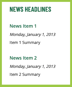
This option provides an opportunity to display news headlines, summaries and publication dates (optional) that link to news articles you’ve created and posted on your website. It is available in the one or two-column format. This widget is a good option for your unit if it generates lots of news stories and has a communications professional on staff. It is best practice not to duplicate stories in this widget already found in your rotator (if applicable) or another widget.
News - Manual - One-Column options include:
- News Item (3 minimum)
- News Item 4 and 5 are optional.
- Headline
- No character limit.
- Display Date (optional)
- Day of Week (optional)
- Month (optional)
- Day of Month (optional)
- Year (optional)
- URL
Links - Styled List
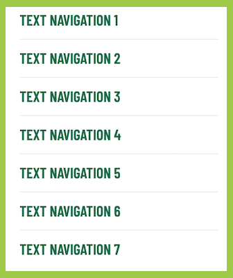
If you choose the small photo, rotator, or video option, you can opt to display an additional widget to the left or righthand side, including a "Links - Styled List" widget. This widget is a good option for units who need additional navigation on their homepage. Make sure not to duplicate links already found in your main navigation.
Links - Styled List options include:
- Name
- Name has a character limit of 20.
- URL (3 minimum)
- URLs 4-7 are optional.
Text - One-, Two-, or Three-Column
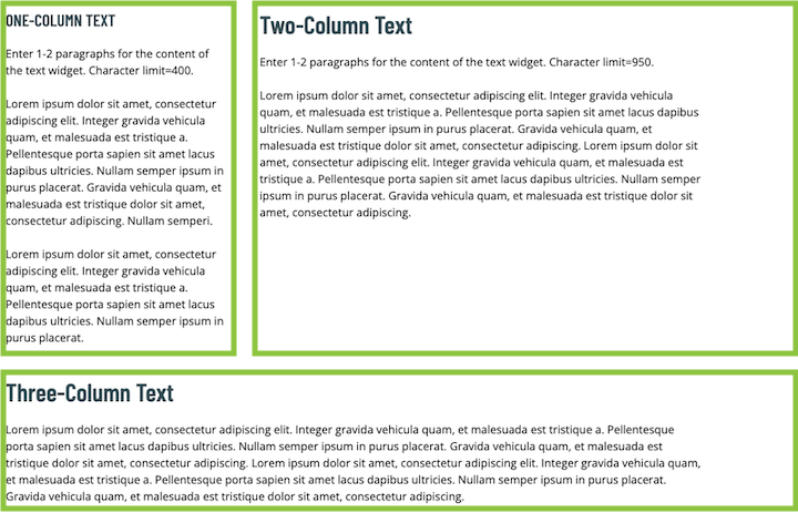
This option provides an opportunity to display a block of text to welcome visitors or to display important information regarding your unit. It is not recommended for units that do not have a communication professional on staff. It can either be used as a one-column, two-column, or three-column widget.
Text - One-, Two-, or Three-Column options include:
- Title
- Title has a character limit of 25.
- Text Box (limited WYSIWYG Editor)
- One-column has a character limit of 400.
- Two-column has a character limit of 950.
- Three-column includes an additional hyperlink with an arrow.
Full List of Widgets
- Button(s) – Centered
- Calendar – Automatic
- Calendar – Automatic – Google
- Calendar - Manual
- Call to Action
- Featured Story
- Featured Story – Three-Column Grid
- Links - Styled List
- News – Automatic - One-Column
- News – CMS Feed - One-Column
- News – CMS Feed - One-Column Feature with Image
- News – CMS Feed - One-Column with Image
- News – CMS Feed - Two-Column with Image
- News - Manual - One-Column
- News - Manual - One-Column with Image
- News – Manual - Two-Column with Image
- Text – One-Column
- Text – Two-Column
- Text – Three-Column