Text Pages
Components
Recorded Workshop
Components are a form-based type of reusable content that gathers information and adds it into complex design elements. A Component on a page prompts you to enter information and adds source code to format and display the information on the page. Components can be used on Text or Gallery pages.
Add a Component to a Page
- Click on the Component icon in the WYSIWYG Editor.
- Choose the Component you'd like to use.
- A window will open — add in all information in the fields where necessary.
- Click "Save".
- The Component will then display as it will look on the page.
Edit a Component
- While on the page, click "Edit".
- Click on the Component, then click on the pencil icon.
- Edit the fields where necessary.
- Click "Save".
- The Component will then display as it will look on the page.
Delete a Component
- While on the page, click "Edit".
- Click on the Component, then click on the "X" icon.
- Click "Save".
Available Components
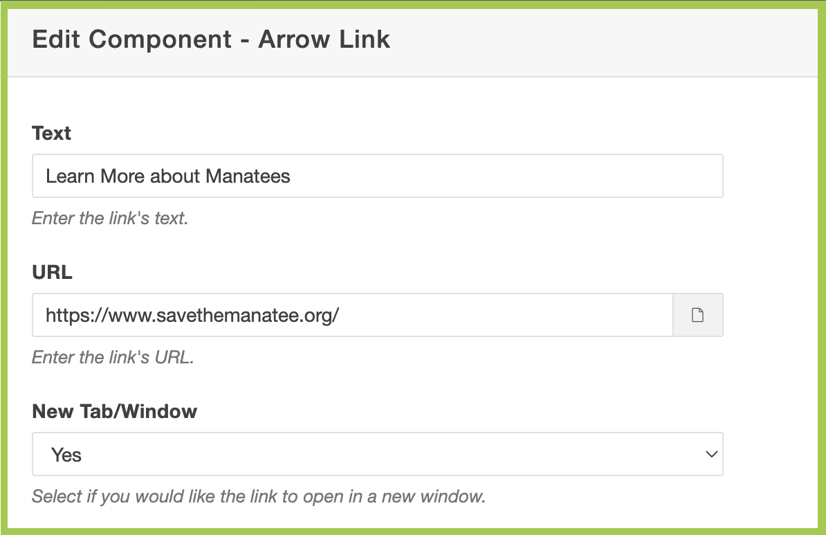
The Arrow Link Component creates linked text alongside an arrow that animates with a mouse hover to call attention to the item.
Arrow Link Specifications
- All required Arrow Link options include:
- Text
- URL
- New Tab/Window
- Yes or No
- Yes or No
- Text has no character limit.
- Recommended character limit: 70 (maximum)
- URL can open in the same window or a new window.
Add Arrow Link Component to a Page
- Follow the Add the Component to a Page instructions from above.
- Choose the "Arrow Link" Component, then click "Insert".
- A window will open — add in all information in the fields where necessary (Text, URL,
New Tab/Window).
- Click "Save".
The Component will then display as it will look on the page:
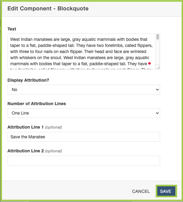
The Blockquote Component creates a callout quote on a page, using larger font and quotation marks.
Blockquote Specifications
- All required (unless otherwise noted) Blockquote options include:
- Text
- Display Attribution?
- Yes or No
- Number of Attribution Lines
- One or Two Lines
- Attribution Link 1 (optional)
- Attribution Link 2 (optional)
- Text has no character limit.
- Attribution can be hidden or displayed.
- The number of attribution lines displayed can be one or two.
Add Blockquote Component to a Page
- Follow the Add the Component to a Page instructions from above.
- Choose the "Blockquote" Component, then click "Insert".
- A window will open — add in all information in the fields where necessary.
- Click "Save".
The Component will then display as it will look on the page: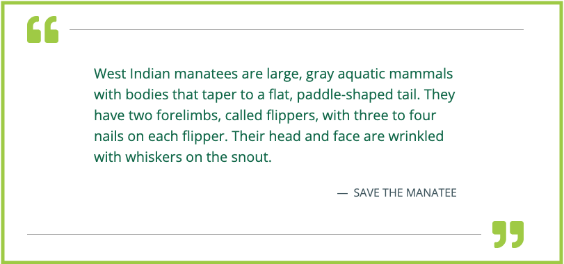
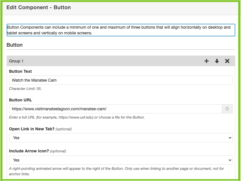
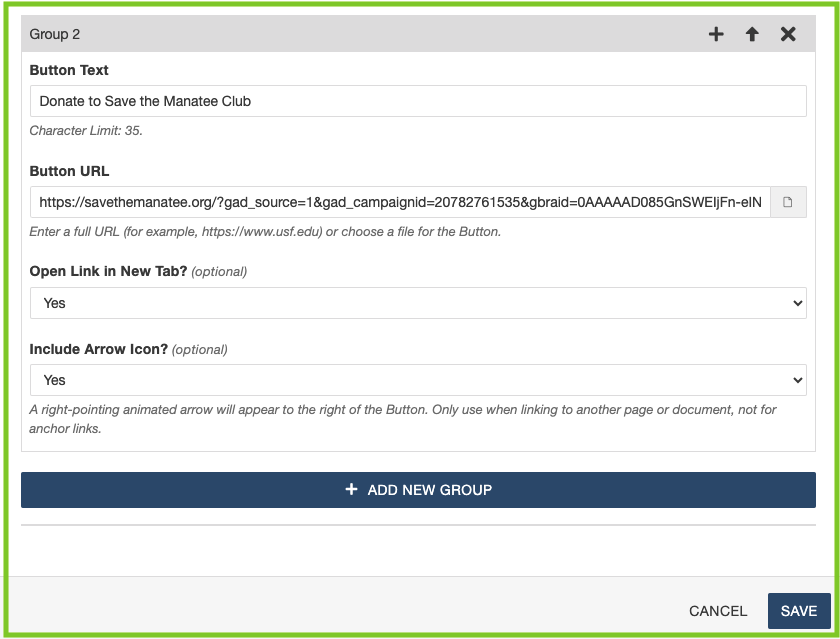
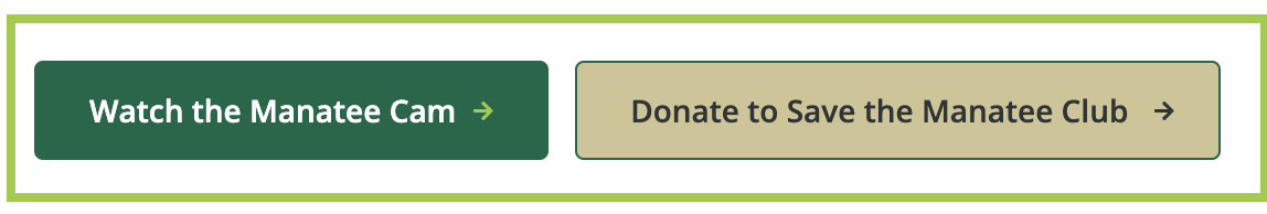
The Button Component creates one to three buttons on a page with consistent design, accessibility, and functionality.
Button Specifications
- All required (unless otherwise noted) Button options include:
- Button Text
- Button Link
- New Tab (optional)
- Yes or No
- Arrow Icon (optional)
- Yes or No
- Yes or No
- Button Text has a character limit of 35.
Add Button Component to a Page
- Follow the Add the Component to a Page instructions from above.
- Choose the "Button" Component, then click "Insert".
- A window will open — add in all information in the fields where necessary.
- Click "Save".
The Component will then display as it will look on the page:
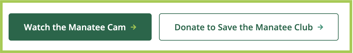
The Component will then display as it will look on the page (on hover):
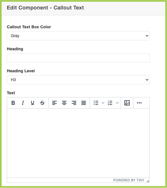
The Callout Text Component creates a colored (Gray or Green) box on a text page that includes a Heading, Text, and Link (optional).
Callout Text Specifications
- All required (unless otherwise noted) Callout Text options include:
- Callout Text Box Color
- Gray or Green
- Heading
- Heading Level
- H2-H6
- Text
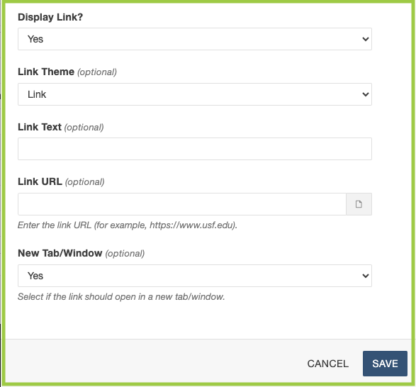
- Display Link?
- Yes or No
- Link Theme (optional)
- Link or Button
- Link Text (optional)
- Link URL (optional)
- New Tab/Window (optional)
- Yes or No
- Yes or No
- Callout Text Box Color
- Callout Text Box component can be Gray or Green.
-
Heading has no character limit.
- Heading Level can display as H2-H6.
- Headings on Text Pages start at H3 and Headings on Gallery Pages on H2.
- Please see our Accessibility resource for guidance on Heading Tags.
-
Text has no character limit.
- Text includes a WYSIWYG Editor.
- Link Theme can display as a Link or a Button.
- Link URL can open in the same window or a new window.
Add Callout Text Component to a Page
- Follow the Add the Component to a Page instructions from above.
- Choose the "Callout Text" Component, then click "Insert".
- A window will open — choose/add in all information in the fields where necessary.
- Click "Save".
The Component will then display as it will look on the page: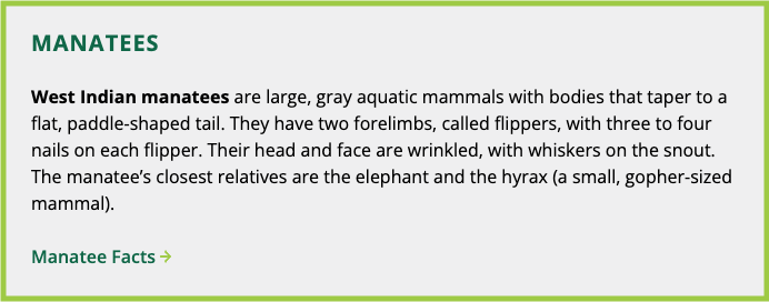
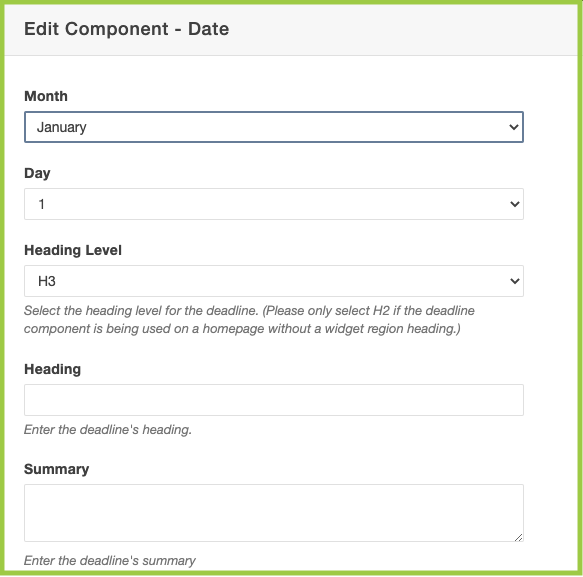
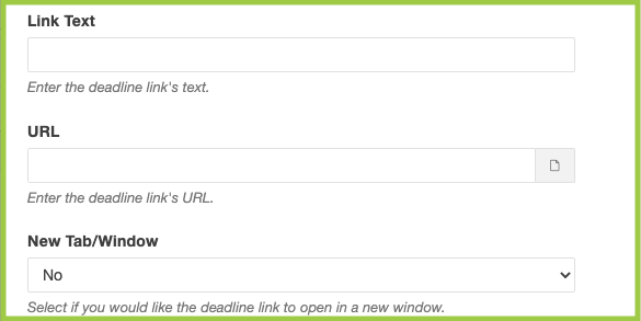
The Date Component creates a calendar/event-like element that displays information, a link, and a large date block.
Date Specifications
- All required (unless otherwise noted) Date options include:
- Month
- Day
- Heading Level
- H2-H6
- Heading
- Summary
- Link Text
- URL
- New Tab/Window
- Yes or No
- Yes or No
-
Heading has no character limit.
-
Summary has no character limit.
Add Date Component to a Page
- Follow the Add the Component to a Page instructions from above.
- Choose the "Date" Component, then click "Insert".
- A window will open — add in all information in the fields where necessary.
The CTA Banner Component creates a vertical or horizontal Call to Action on a Text or Gallery Page, or within a Text - Three-Column widget on homepages, including text and an arrow link.
To have the CTA Banner Component added to a Text - Three-Column widget, please email cmssupport@usf.edu.
CTA Banner Specifications
- All required CTA Banner options include:
- Display
- Horizontal or Vertical
- Text
- Link Text
- Link URL
- Link New Tab/Window
- Yes or No
- Yes or No
- Display
- Text has no character limit.
- Recommended character limit: 70 (maximum)
- Link Text has no character limit.
- Recommended character limit: 30 (maximum)
Add CTA Banner Component to a Page
- Follow the Add the Component to a Page instructions from above.
- Choose the "CTA Banner" Component, then click "Insert".
- A window will open — add in all information in the fields where necessary.
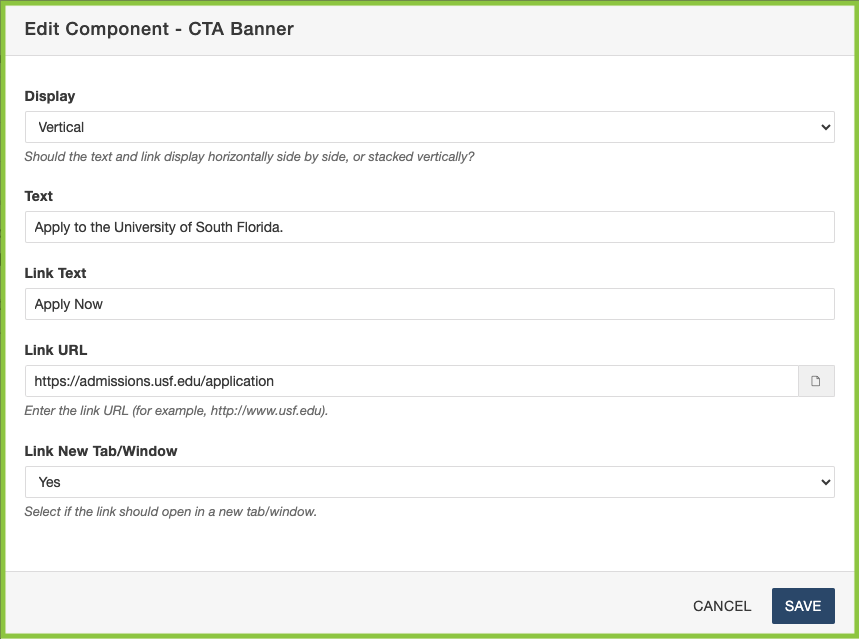
- Click "Save".
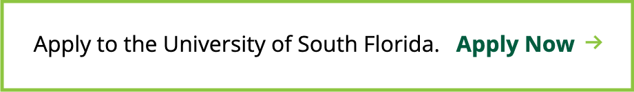
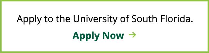
The Component will then display as it will look on the page:
Horizontal View
Vertical View
The Date Component creates a calendar/event-like element that displays information, a link, and a large date block.
Date Specifications
- All required (unless otherwise noted) Date options include:
- Month
- Day
- Time (optional)
- Heading Level
- H2-H6
- Heading
- Summary
- Link Text (optional)
- URL (optional)
- New Tab/Window
- Yes or No
- Yes or No
-
Heading has no character limit.
-
Summary has no character limit.
Add Date Component to a Page
- Follow the Add the Component to a Page instructions from above.
- Choose the "Date" Component, then click "Insert".
- A window will open — add in all information in the fields where necessary.
- Click "Save".
The Component will then display as it will look on the page: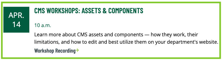
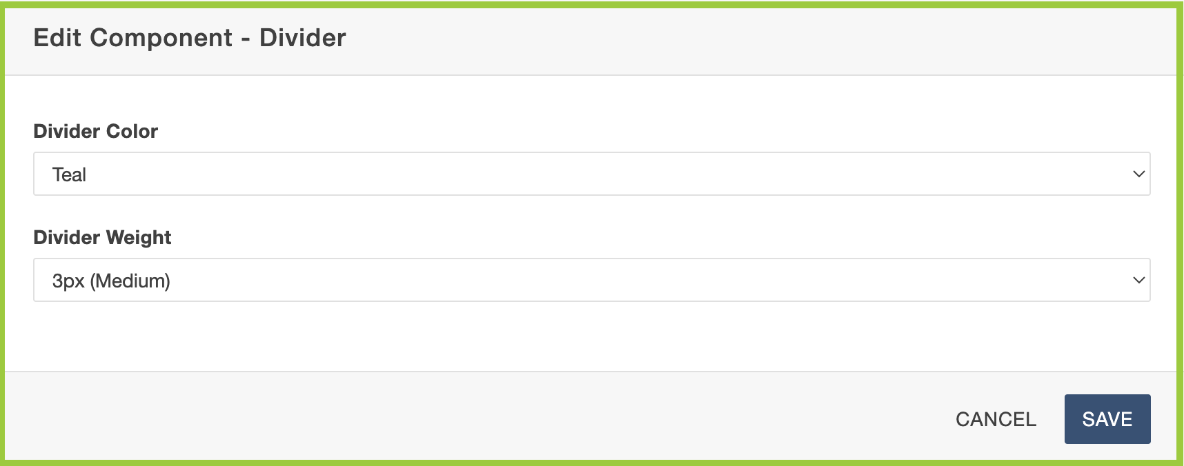
The Divider Component creates a horizontal rule, which can be used to separate sections of content on a page, providing visual breaks and improving readability.
Divider Specifications
All required Divider options include:
-
- Divider Color
- Slate (Default)
- Teal
- Divider Weight
- 1px (Default)
- 2.5x (Medium)
- 5px (Heavy)
- Divider Color
-
Heading has no character limit.
-
Summary has no character limit.
Add Divider Component to a Page
- Follow the Add the Component to a Page instructions from above.
- Choose the "Divider" Component, then click "Insert".
- A window will open — add in all information in the fields where necessary.
The Faculty Component creates a text section on a page to include faculty contact information, CV, etc.
Faculty Specifications
- All Faculty options include:
- Title (optional)
- Link to CV (optional)
- Phone (optional)
- Email Address (optional)
- Office Number (optional)
- Area of Interest (optional)
- Users can choose to hide or display any or all Faculty options.
- The CV link can open as an internal CMS document or external document.
- The Faculty option fields have no character limits.
Add Faculty Component to a Page
- Follow the Add the Component to a Page instructions from above.
- Choose the "Faculty" Component, then click "Insert".
- A window will open — add in all information in the fields where necessary.
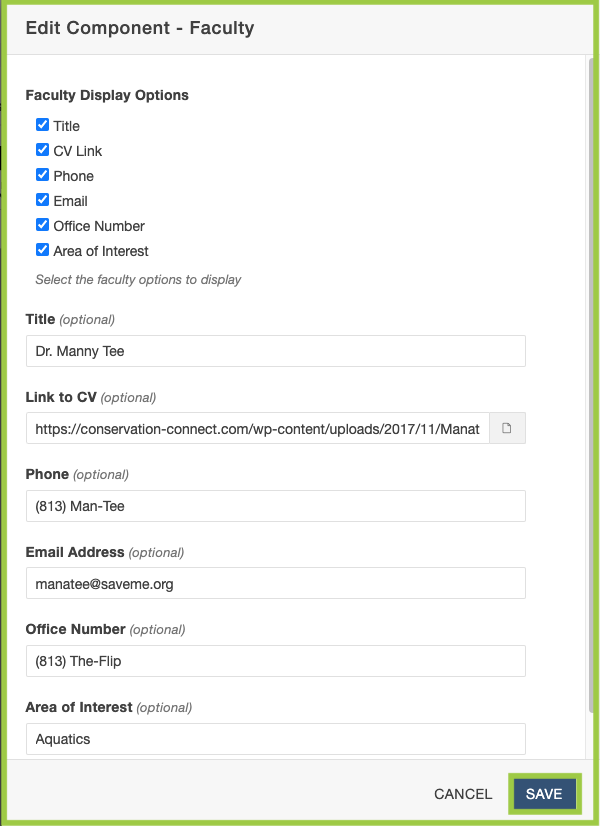
- Click "Save".
The Component will then display as it will look on the page: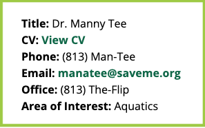
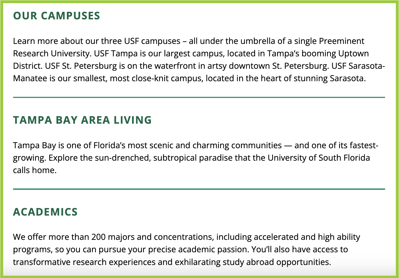
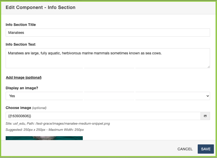
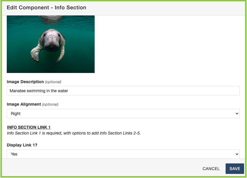
The Info Section Component creates organized sections, typically including links related to a particular topic. Each Info Section allows for a Title and Text and an optional Link (including Link Text and a URL).
Info Section Specifications
- Info Section Title
- Info Section Text
- Add Image (optional)
- Display an image?
- Yes or No
- Choose Image (optional)
- Image Description (optional)
- Image Alignment (optional)
- Left or Right
- Info Section Link 1(-5)
- Display Link 1(-5)?
- Yes or No
- Link 1(-5) Text
- Link 1(-5) URL
- Link 1(-5) New Tab/Window
- Yes or No
- Yes or No
- Info Section Title has no character limit.
- Info Section Text has no character limit.
- Image can be left or right aligned.
-
Link 1 is required.
-
Links 2-5 are optional.
-
- Link Text has no character limit.
- Each component is only one info section, but can contain up to five links.
Add Info Section Component to a Page
- Follow the Add the Component to a Page instructions from above.
- Choose the "Info Section" Component, then click "Insert".
- A window will open — add in all information in the fields where necessary.
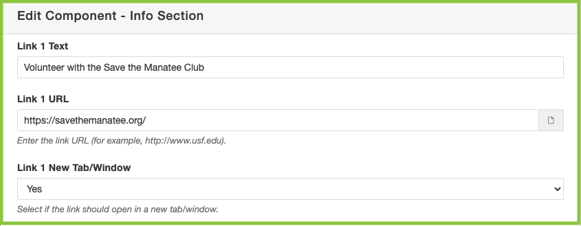
- Click "Save".
The Component will then display as it will look on the page: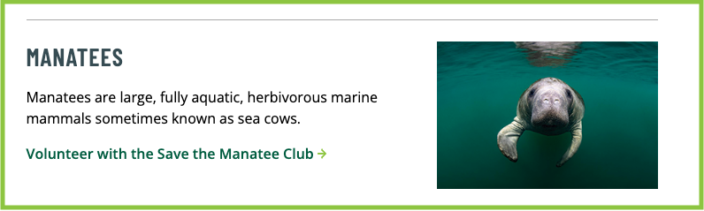
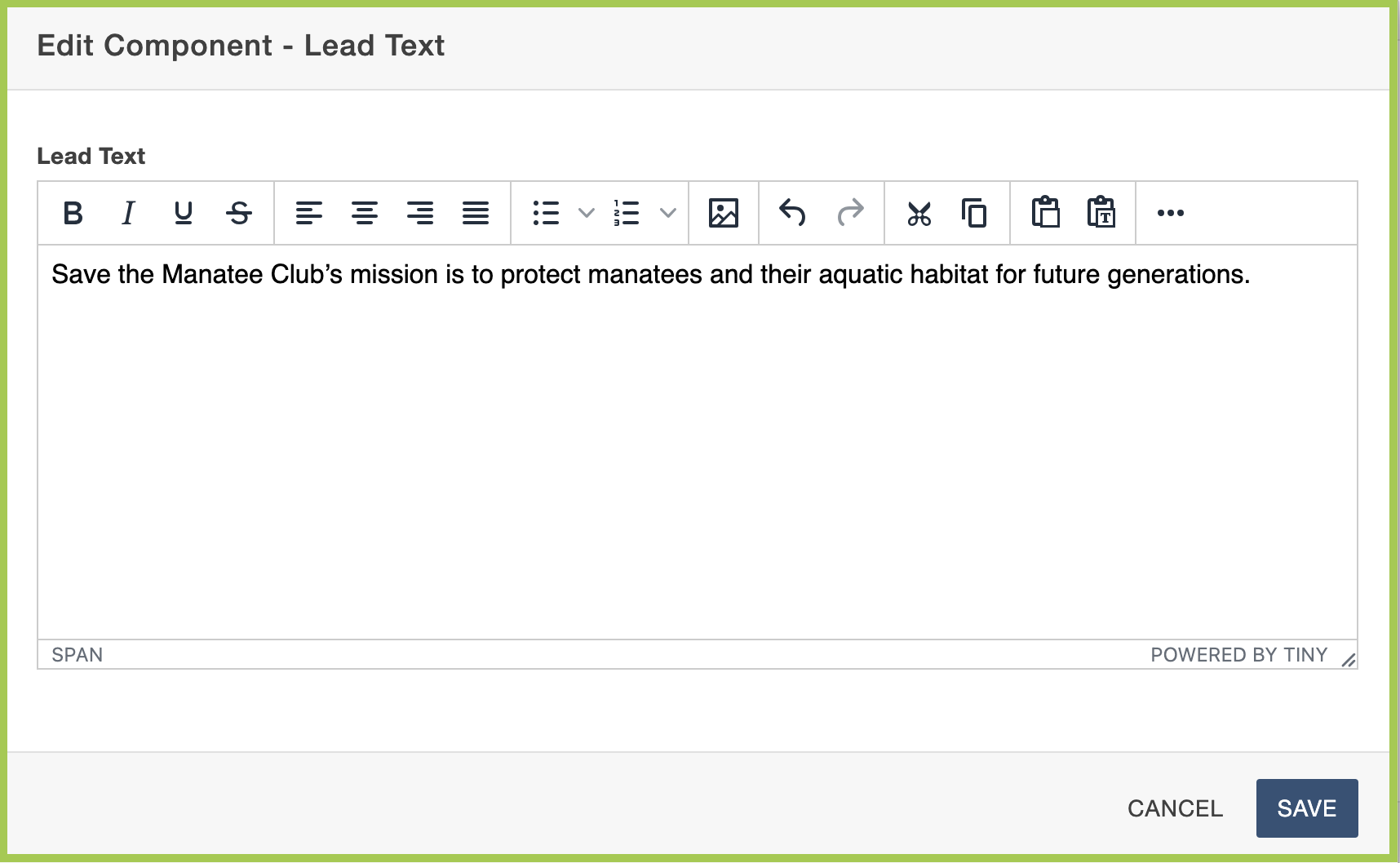
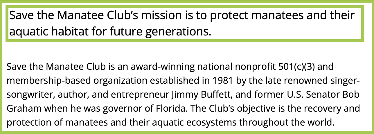
The Lead Text Component creates larger-styled text intended to be used as an introductory sentence or paragraph.
Lead Text Specifications
- The Lead Text Component is comprised of a mini WYSIWYG Editor.
- The mini WYSIWYG Editor has no character limit.
Add Lead Text Component to a Page
- Follow the Add the Component to a Page instructions from above.
- Choose the "Lead Text" Component, then click "Insert".
- A window will open — add in all information in the fields where necessary.
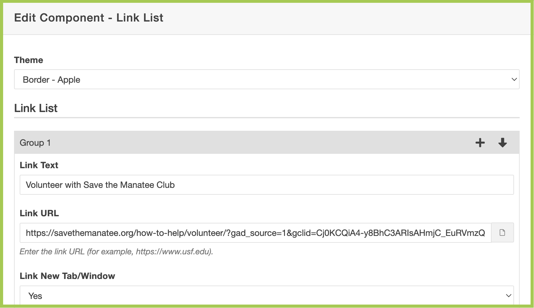
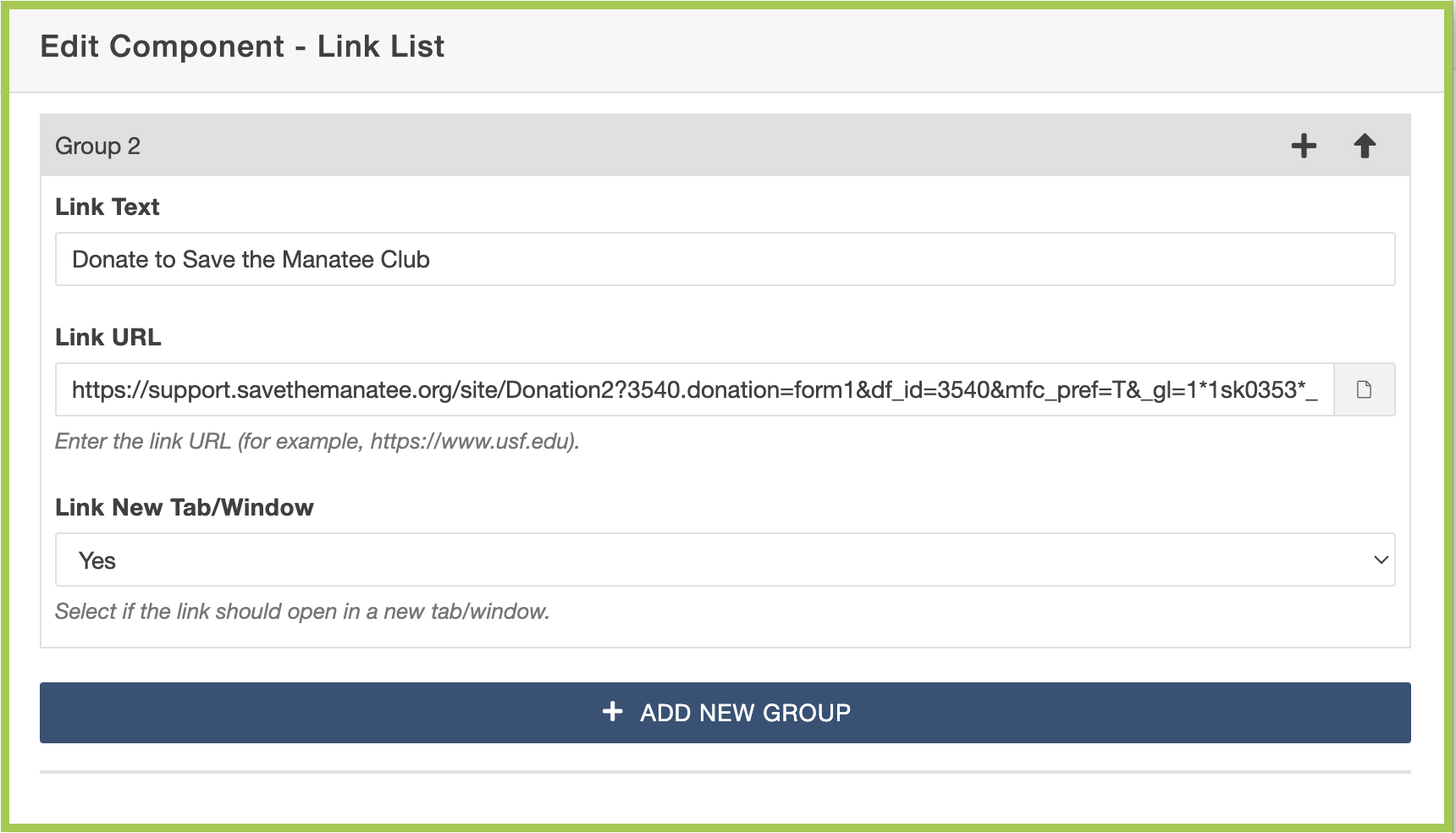
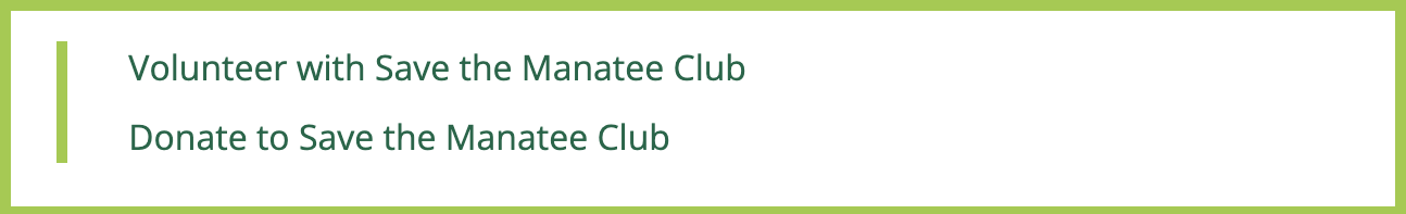
The Link List Component creates a collection of links organized in a list format, which can be used to guide users to sections of the page, related pages, resources, or external websites.
Link List Specifications
All required (unless otherwise noted) Link List options include:
- Theme
- Border - Apple
- Border - Teal
- Square Arrows - Apple
- Square Arrows - Teal
- Chevrons - Apple
- Chevrons - Teal
- Link Group 1 and 2 (required)
- Link Text
- Link URL
- Link New Tab/Window
- Yes or No
- A minimum of two Link Groups are required, but do not have a maximum limit.
- Each Link Group creates a single link within the list.
- Link Groups may display some or all of the following icons:
- Plus sign ±: This adds a new Link Group directly after this Link Group
- Up arrow ↑: This moves the Link Group up one spot in the Link Group order
- Down arrow ↓: This moves the Link Group down one spot in the Link Group order
- X: This deletes the Link Group
- Link Text has no character limit.
- Link URL can open in the same window or a new window.
Add Link List Component to a Page
- Follow the Add the Component to a Page instructions from above.
- Choose the "Link List" Component, then click "Insert".
- A window will open — add in all information in the fields where necessary.
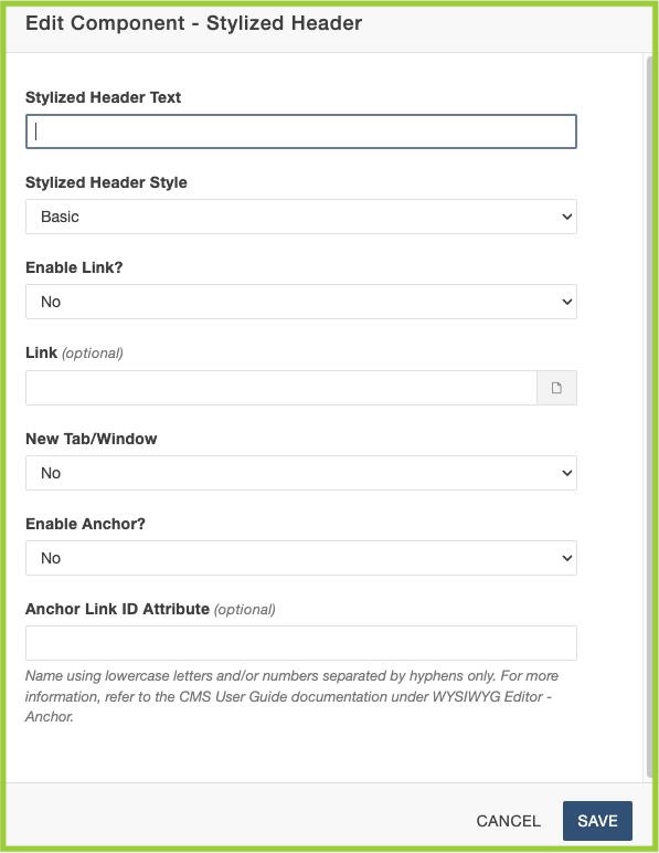
The Stylized Header Component creates visually dynamic headers on Text (H3) or Gallery Pages (H2).
Stylized Header Specifications
- All required (unless otherwise noted) Stylized Header options include:
- Stylized Header Text
- Stylized Header Style
- Basic or Enhanced
- Enable Link?
- Yes or No
- Link (optional)
- New Tab/Window
- Yes or No
- Enable Anchor? (optional)
- Yes or No
- Anchor Link ID Attribute (optional)
- Stylized Header Text has no character limit.
- Recommended character limit: 70 (maximum)
- Stylized Header Style can display as Basic or Centered.
- Link can open in the same tab/window or in a new tab/window.
Add Stylized Header Component to a Page
- Follow the Add the Component to a Page instructions from above.
- Choose the "Stylized Header" Component, then click "Insert".
- A window will open — add in all information in the fields where necessary.
- Click "Save".
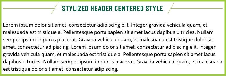
The Component will then display as it will look on the page:
Basic Style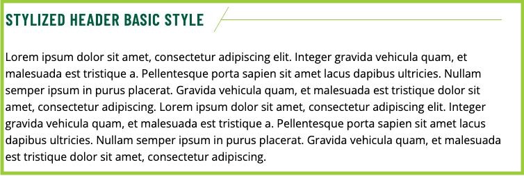
Centered Style
Timeline Event (by request only)
Please note: The Timeline Event Component can only be used in the Time Period field of an already-created Timeline Snippet. The Timeline Event Component adds event and details to the accompanying Time Period in a Timeline Snippet. Please note: More than one Timeline Event Component can be added to a single Time Period.
To request a Timeline Event Component, please email cmssupport@usf.edu.
Timeline Event Specifications
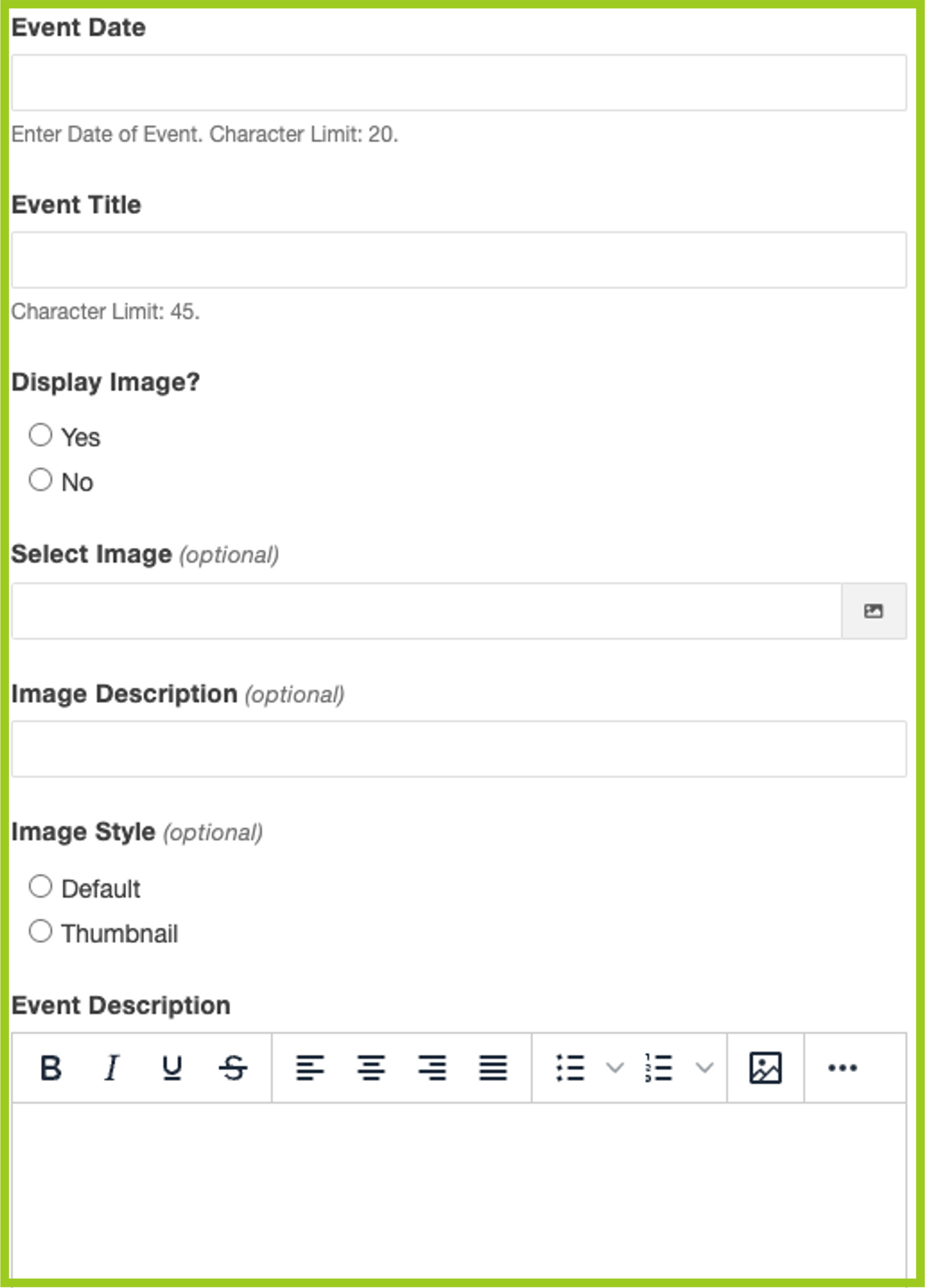
- All required (unless otherwise noted) Timeline Event options include:
- Event Date
- Event Title
- Display Image?
- Yes or No
- Select Image (optional)
- Image Description (optional)
- Image Style (optional)
- Event Description
- Event Date has a character limit of 20.
- Event Title has a character limit of 45.
- Display Image is optional.
- Image Style can be Default or Thumbnail.
- Event Description has no character limit.
Add Timeline Event Component to Timeline Snippet
- Make sure you have already created a Timeline Snippet and add the Timeline Event Component to the Time Period field.
- Follow the Add the Component to a Page instructions from above.
- Choose the "Timeline Event" Component, then click "Insert".
- A window will open — add in all information in the fields where necessary.
- Click "Save".
-
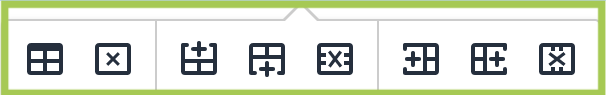
To add an additional Time Period, right click on the Timeline Snippet Table and choose which option you'd like to add (i.e. Row > Insert Row Before). You can also make changes to the cells themselves or choose Table Properties to make other adjustments.
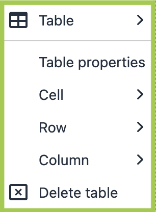
-
You can also use the pop-up toolbar and click on the appropriate icon to execute the task.
- Once a Time Period has been added, follow the same instructions to add an accompanying Timeline Event Component. Please note: More than one Timeline Event Component can be added to a single Time Period.
Once completed, the Snippet + Component will then display as it will look on the page: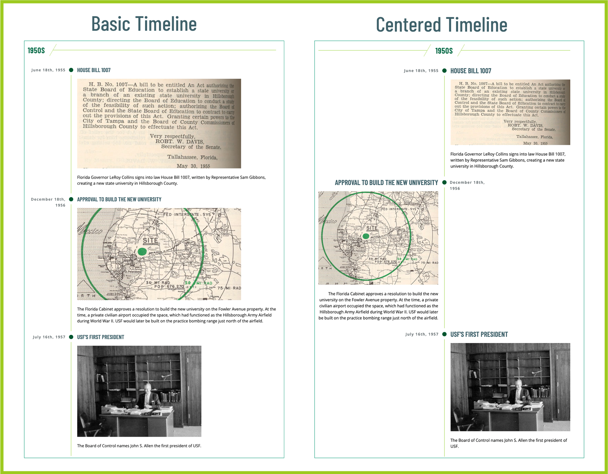
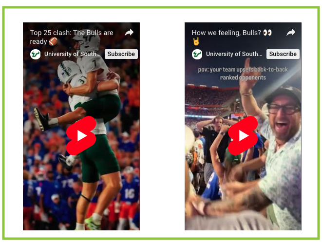
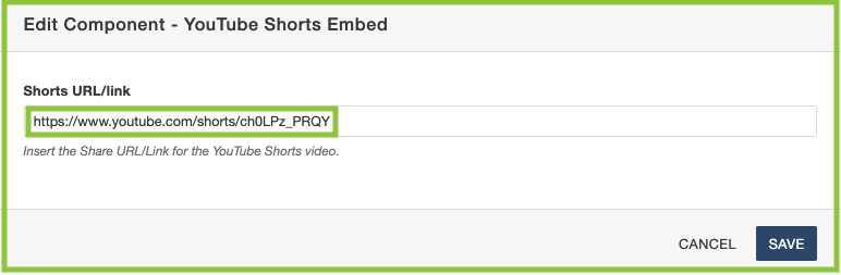
The YouTube Shorts Embed Component allows users to embed a YouTube Shorts video on a Text, Gallery, or Internal News Article page.
YouTube Shorts Embed Specifications
- All required (unless otherwise noted) YouTube Shorts Embed options include:
- YouTube Shorts Link
- YouTube Shorts Link
- This component is compatible with YouTube Shorts' videos only.
Add YouTube Shorts Embed Component to a Page
- Follow the Add the Component to a Page instructions from above.
- Choose the "YouTube Shorts Embed" Component, then click "Insert".
- A window will open — add in all information in the fields where necessary.
- Click "Save".
The Component will then display as it will look on the page:
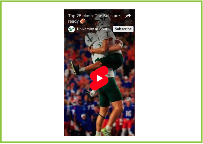
The Component will then display as it will look on the page (in a Two-Column Text snippet):